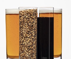
Designing Bottle Labels

With the holiday season here, it’s probably crossed your mind that homebrew makes a great gift for family, friends, co-workers and anyone else who wound up on the “nice” list this year. You are already proud of the beer you brewed, but when it comes time to give your homebrew away as a gift, you’ve got to be proud of the packaging too. You don’t want to give your brew away in a bottle with a half-peeled commercial label on the bottle. Spend a little time and make your own homebrew label. In addition to making your bottles look smooth, you can then enter those labels into contests (ahem, like BYO’s annual label contest held each spring) and win great prizes! For advice on how to design a great homebrew label, we asked the experts.
Lindsay Blasquez — GrogTag Head Designer
One thing that makes a good label is humor. This is great because you don’t have to be an expert in design to create a memorable label if there is a quality pun or joke involved. I always remember the labels that make me laugh.
Something else that I think sets certain labels above the rest is good typography. The best beer pun in the world can unfortunately be ruined if written in a font like Bleeding Cowboy. Try to stick to one or two fonts and keep in mind what info is most important hierarchically when deciding font size and weight.
Danielle Olesen — StickerYou Brand Manager
Here are some of my top tips on how to design for print. Labels often look great on the computer, but the results are less than stellar when printed.

David Noone — Noontime Labels Owner
1. Having a theme and sticking with it is critical to creating a good label design. A novel or movie might have a lot going on and still be great, (it made me laugh, it made me cry . . .), but if a label has conflicting design elements, it can be confusing for the viewer. All the elements that make up the complete design . . . color, images, text, and final composition should all be put together in a cohesive way to tell a story and create the intended “attitude.” If the theme is light and whimsical, then bright and happy colors with a casual font would make sense. A dark, serious beer label with angular calligraphy text and a picture of a kitten probably would not make much sense. All the elements of the label should make sense together.
2. Font choice is extremely important since it helps define the style of the label. The font’s shape and “mood” should go with the theme of the label. Also limit your fonts to no more than 2 or 3. Any more than that becomes very confusing to the viewer. An easy way to get your text to “pop” is adding a shadow, outline, or glow, which can help isolate the text from the background. This helps separate it and adds dimensionality, especially if you have a very busy background.
3. Use of color can be a very powerful tool. Different colors make us think and feel different things — blue can be cold or serene, green is fresh and alive, black can be elegant or serious. You can use color to communicate what the character of the beer is or the mood of the label; reds and purples can be used to convey lusciousness, or yellows and oranges to imply citrus.
4. An easy way to make your label really pop is to use contrast. Using strikingly different colors, or darkness/lightness values can really help make your text easily seen against the background. Blue against a black background won’t be seen as well as yellow against a black background.
5. Don’t forget to think about how the label will look against the background of the bottle, which will frame the label with its own color.